9 Ways to Improve Lead Gen with Form Optimization
On this page
(last updated August 29, 2022)
If your sales-enabled website is a lead-generating hurricane, its forms are the eye of the storm.
Forms power the entire operation because they allow your customers to leave their contact information for your sales team.
But, they can be the dry land that takes all the steam out of the whole thing if they’re not working well.

Form optimization is like putting a hurricane over warm, open water. It reduces friction and nets you even more visitor conversions.
Let’s take a look at some ways to do that, shall we?
Here are the top 9 ways to optimize your forms:
- Make Your Visitors Feel Secure
- Determine the Right Number of Form Fields
- A/B Test It
- Utilize Drop-Down Questions
- Create CTAs Inside Your Forms
- Leverage a CRM
- Decide Between Required Fields & Optional Fields
- Optimize for Mobile
- Hide Fields for Second-Time Users
1. Make Your Visitors Feel Secure
First things first. One of the best ways to build trust (and thus, conversions) is to make sure your visitors know that their information is safe with you.
In other words, clarify on your forms right off the bat what you’ll be doing with the precious information they’ll be sharing with you.
Present the link to your privacy policy clearly and close to your email field label or right below the submit button.
Letting your visitors know that third parties won’t be emailing or calling just because they allowed you to do so will instill trust and support your credibility as the good egg that you are. That means conversions!
Don’t have a privacy page yet? Here’s a great example from our partners at HubSpot (speaking of good eggs).
2. Determine the Right Number of Form Fields
Truth: No one lives to fill out forms.
An equal truth: Your sales team doesn’t live to spend hours qualifying leads.
So how do you balance these two?
You might think that keeping the form short is the answer, but not always. A short form could decrease the perceived value of your offering as well as leave your sales team guessing as to pertinent information they might need.
Work to make sure the length of your form mirrors the value of your offer.
For instance, a long-form is in order if what you’re giving away sits on your buyer cycle at a higher level of readiness to buy such as a lead magnet like an eBook or whitepaper.
For case studies, checklists, and infographics that are gated on your website, a short form works just fine.

3. A/B Test It
An A/B test does exactly what its title suggests: it compares one thing against another.
In this case, if you have a five-field form that has a low conversion rate, and you’d like to see if it could do better, create another form with three fields and display them both. (Don’t get stuck on these numbers; they’re completely hypothetical).
Remember, it’s not a foregone conclusion that shorter forms convert more leads, so running an A/B test like this over a month’s time will help you figure out the perfect number of fields for each of your specific offerings.
Here’s an example:
- If Form A (let’s say it’s the form with 5 fields) gets 1,000 visits and 10 of those people filled it out and converted to leads, that form has a 1% conversion rate. Meh.
- If Form B (your 3-field form) gets 1,000 visits and converts 50 into leads, that would be one doozy of a form with a 5% conversion rate. There’s your keeper!
Forms optimized? Check!
4. Utilize Drop-down Questions
Simplify your form by including drop-down questions as often as you can to keep open-ended questions to a minimum.
This helps you get the information you need without exhausting your potential leads with a form that requires them to type out their answers 100% of the time.
Drop-down questions are useful in situations like this:
- Job title: Ask for the visitor’s role level (C-level, Owner, Manager, etc.) when you need to know if they’re a decision-maker.
- "How can we help you?": Give them a drop-down menu with the pain points that are relevant to your ideal customers.
5. Create CTAs Inside Your Forms
Use the real estate inside your forms to encourage your leads even more by putting another call to action (CTA) on them.
Think about it: Once your visitor decides to fill out a form, they trust you, and they might just decide that they’re ready to talk sales right this minute.
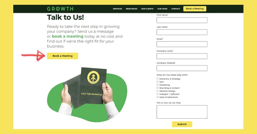
Our HubSpot Onboarding form includes a CTA that invites visitors to book a meeting with our Director of Business Development, Will Davidson.
Take a look:

(FYI: The big red arrow isn’t on our website. That would just be ridiculous, right!?).
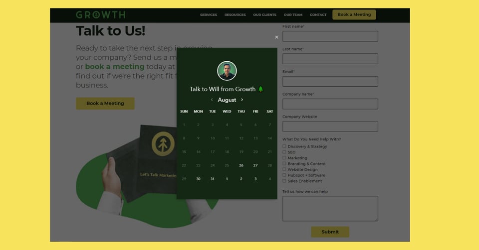
Check out what that button does:

Clicking on the “Book a Meeting” CTA grays out the form (to avoid user confusion) and opens Will’s calendar. Super convenient for someone who’s ready to get started onboarding HubSpot CRM ASAP, and who wouldn’t be?
6. Leverage a CRM
Get yourself a CRM! It’s absolutely priceless for a myriad of reasons, but for forms, it lets you remove fields like:
- Company name
- Website URL
- Number of employees
- Industry
- Country
- State/Province
- City
- Recent funding amount
That’s because Client Relationship Management software (CRM) like HubSpot collects this data for you.
If you need help with HubSpot onboarding, that's one of our superpowers at Growth. We're happy to help. Let us know what you need.
7. Decide Between Required Fields & Optional Fields
Even if it’s not required information, it could still be incredibly helpful to your sales team, and some visitors will be happy to explain what they need if you ask nicely.
If you ask an open-ended question like “What’s your greatest marketing challenge,” for instance, that could really help, but it shouldn’t be required.
Required fields should show a clear asterisk (*) next to it so that your visitors know which question they must fill out to receive your offer and which ones they can skip if it’s not applicable to their situation.
This can help reduce visitor exhaustion and frustration which, again, builds trust (which you deserve).
8. Optimize for Mobile
According to Statista, over 6 BILLION people in the world have smartphones. That’s almost all of us!
That means that your website should be optimized for mobile. If it's not, you’re losing a LOT of potential traffic and leads.
Therefore, always test your forms to make sure they look and function well on mobile devices.
9. Hide Fields for Second-Time Users
Only show long-form fields for your first-time visitor. That way, if you have recurring visitors to your site who’ve already filled out a form for your eBook (and they’re now wanting your cool infographic), they don’t have to give you their information again.
How do you know the difference? Sounds like magic, but it’s actually HubSpot again.
Their free form builder allows you to put that frustrating form processing rabbit right back in the hat.
That’s magic that can convert a visitor more easily on a second offering.
Optimizing your forms on your website greases the wheels of your visitors toward conversion and manifests a positive user experience that makes a big difference to your bottom line.
If you need help optimizing your lead generation in every aspect of your business, ask us! We’re right here.
Explore More Insights: Related Blog Posts
-
 Inbound MarketingMay 19, 2020
 Ashley Lilly
Turn Your Website into the Ultimate Sales Tool
(Updated March 31, 2022) If you’re like most marketers, you know there are a multitude of tools out there...
-
 Inbound MarketingNov 5, 2021
 Growth Marketing Firm
6 Ways to Optimize Your Landing Pages
If your website offers a resource for free (like an ebook, a tool, or a newsletter) in exchange for a...
-
 Sales EnablementJan 28, 2022
 Growth Marketing Firm
Lead Types: How to Identify + Engage Them to Increase Sales
In our previous blog article, 8 Daily Habits for a Healthy Sales Pipeline, we went over our top strategies...
-
 Sales EnablementSep 3, 2021
 Growth Marketing Firm
Top 6 Tips for Optimizing Your Website for Lead Generation
(last updated August 29, 2022) Before going heads-down on optimizing your website for lead generation, take a...
-
 Sales EnablementSep 1, 2021
 Growth Marketing Firm
Top 10 Strategies for Lead Generation
Lead generation is the process of attracting prospects to your business. A visitor can be converted to a lead...
-
 Inbound MarketingJul 8, 2022
 Growth Marketing Firm
The Growth Guide to Lead Magnets
Growth Marketing Firm · The Growth Guide To Lead Magnets “Lead Magnet!” What a great term, right?!
-
 Inbound MarketingMar 23, 2022
 Growth Marketing Firm
8 Great Copywriting Tips from Growth
A copywriter’s job is to find the right word for the right customer at the right time and put it in the exact...
-
 Inbound MarketingOct 27, 2021
 Growth Marketing Firm
Marketing And Sales Glossary: Terms to Know
(last updated September 9, 2022) Every group and industry has a shared working language full of terms that...
-
 Inbound MarketingAug 30, 2021
 Growth Marketing Firm
Building a Micro-Influencer Marketing Strategy
Influencer marketing, much like celebrity endorsements, follows a simple premise: A brand works with a public...
